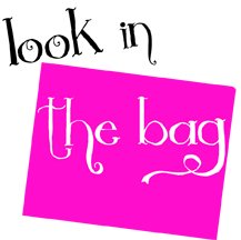
One Saturday in July 2012, I sat and watched Neelam work on a logo for Look-in-the-Bag.
There was a time when I would have thought it was a bit premature to have a logo before one had a product. Now I'm not so sure.
I used to be scathing about marketing; nowadays though, I'm a bit more open-minded about its value. Having a wife with a background in advertising has certainly played a part in my change of heart, but it was beginning to change before I met her.
My brilliant, beautiful and creative wife (who carefully reads all my blog entries before they're published) enjoys designing logos - which is just as well because she's had to do it a lot over the years. She began working on a logo in a quiet moment not long after we came up with the idea of Look-in-the-Bag. Her initial thoughts led to:
It was clear and neat, but somewhat formal and reminiscent of a chainstore label. So she played around a bit more and came up with:
Neelam was quite pleased with this logo and was slightly disappointed by my lack of enthusiasm. It appealed to her because of its quirkiness, and it did begin to grow on me. However, after we had discussed it a bit further, Neelam decided she wanted to try coming up with a design which could link the company name and theme. I liked this idea and sat beside her as she played around with fonts, colours and shapes.
It was fascinating watching her. I know nothing about design, but I know a little about poetry. It seems that, just as with poems, "less is more" when it comes to logos.
There was a time when I would have thought it was a bit premature to have a logo before one had a product. Now I'm not so sure.
I used to be scathing about marketing; nowadays though, I'm a bit more open-minded about its value. Having a wife with a background in advertising has certainly played a part in my change of heart, but it was beginning to change before I met her.
My brilliant, beautiful and creative wife (who carefully reads all my blog entries before they're published) enjoys designing logos - which is just as well because she's had to do it a lot over the years. She began working on a logo in a quiet moment not long after we came up with the idea of Look-in-the-Bag. Her initial thoughts led to:
 |
| A first attempt |
It was clear and neat, but somewhat formal and reminiscent of a chainstore label. So she played around a bit more and came up with:
 |
| A bit more funky |
Neelam was quite pleased with this logo and was slightly disappointed by my lack of enthusiasm. It appealed to her because of its quirkiness, and it did begin to grow on me. However, after we had discussed it a bit further, Neelam decided she wanted to try coming up with a design which could link the company name and theme. I liked this idea and sat beside her as she played around with fonts, colours and shapes.
It was fascinating watching her. I know nothing about design, but I know a little about poetry. It seems that, just as with poems, "less is more" when it comes to logos.
 |
| The trademarked logo |
No comments:
Post a Comment